There is no shortage of free information online.
From conversion rate optimization tips to product pricing and marketing, everyone and their brother is looking to educate you.
So what makes this article any different?
We’re e-commerce website development experts. We’ve created over 100 e-commerce stores, with a track record for success. Some of our customers have increased sales over 10x and one has doubled revenue every year for the last 5 years running. We’ve seen and tried every e-commerce best practice you can imagine.
Here’s what we’ve learned from over a decade in the business:
Table of Contents (show)
- E-commerce Website Best Practices
- Use Free Shipping to Increase Conversions 54%
- Add Trust Badges
- Give Your About Page Some Love
- Bake Customer Reviews Into Your Process
- Make Sure Your Site Loads in Less Than 3 Seconds
- Mobile E-commerce Best Practices
- Allow Image Zoom
- Use Touch-Optimized Keyboards for Each Form Field
- Don’t Use Auto-Rotating Image Carousels
- Make Guest Checkout Obvious
- Disable Auto-Correct at Checkout
- E-commerce Product Page Best Practices
- Use Big, Sexy Product Images to Mesmerize Visitors Into Customers
- Create a Product Video (Or 360-Degree View) to Give Visitors A Better Mental Picture
- Use Price Anchoring and Scarcity to Hack Visitors Psychology.
- Have a Prominent Call to Action and Rake In the Sales
- E-commerce UX Best Practices
- Adhere to The “F” Pattern
- Use No More Than 2-3 Colors Sitewide
- Use Large, Readable Font
- Add Breadcrumbs
- Offer Multiple Payment Opt
- E-commerce Homepage Best Practices
- Always Show The Search Bar So Visitors Never Get Lost
- Show Browsing History for Personalized Suggestions
- Display Your Business Address and Support Number
- Include Social Proof
- Make a Sales and Best-Sellers Section
E-commerce Website Best Practices
Let’s start off with some general website best practices and e-commerce trends you can use on your site.
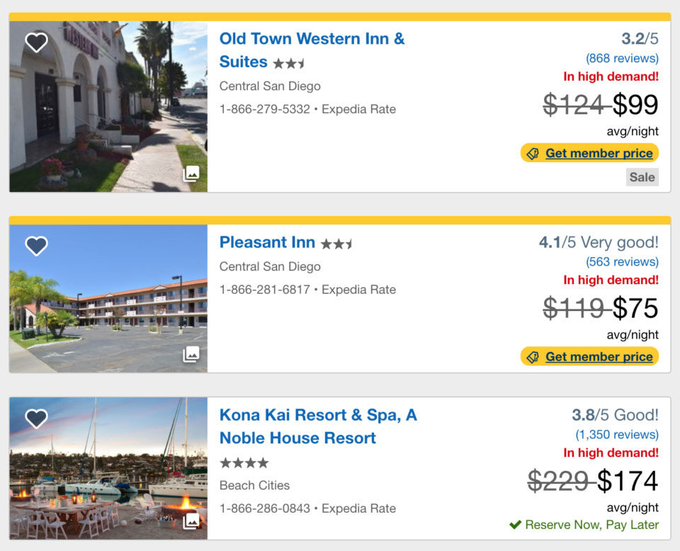
1. Use Free Shipping to Increase Conversions 54% (And Show Shipping Costs on EVERY Page).
Free shipping used to be nice to have. Today, however, it’s practically a requirement.
Let me explain:
Roughly 28% of shoppers will abandon their shopping cart if presented with unexpected shipping costs.
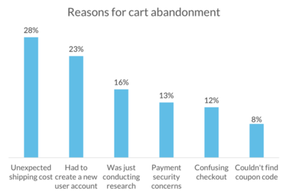
Image Via: resources.vwo.com
Obviously, free shipping isn’t always possible. You need to be able to make a profit! So here are three strategies to implement free shipping on your store without going into the black:
- Raise your prices. This sounds like a no-brainer, but really – you can raise your prices to make up for the cost of free shipping. If nothing else, you can test it on a select few products. If it doesn’t work, try something else.
- Offer free shipping at a certain order price. For example, free shipping on all orders above $50. This is a double whammy – you get a higher average order value (AOV), and you get higher conversions from the free shipping.
- Offer free shipping on certain bundles. For example, when a person adds an item to their cart, have a screen pop up to offer an additional (and relevant) item. If they add that to their cart as well, they’ll get free shipping. Again, win-win!
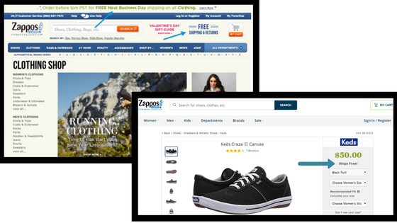
In addition to offering free shipping, you should display shipping costs (and any additional costs, such as taxes) on every page of your website.
Why?
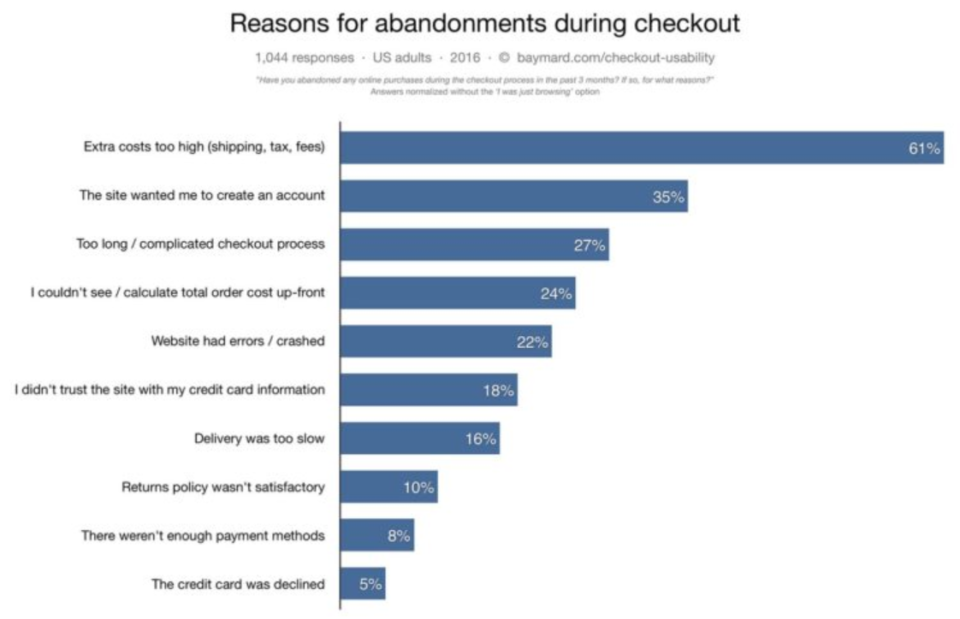
Because the #1 cause for shopping cart abandonment is unexpected costs at checkout.
This is reverse price anchoring, which is a concept I’ll explain in best practice #13. Basically, when people see a number higher than they were expecting, they bolt. Not good.
The second highest reason people abandon cart? Lack of trust. So let’s fix that.
2. Add Trust Badges (But Only The RIGHT Ones).
Trust badges, like the ones below, show website visitors you’re secure and won’t steal their money. Obviously, this is a good thing.
![]()
In fact, trust badges and security seals have been shown to increase your e-commerce sales by 42%!
But only certain badges work.
Research studies by Blue Fountain Media found that VeriSign trust badges are far more trusted (and increase conversions more) than any other trust badge. Take a look:
![]()
That one was easy! Next…
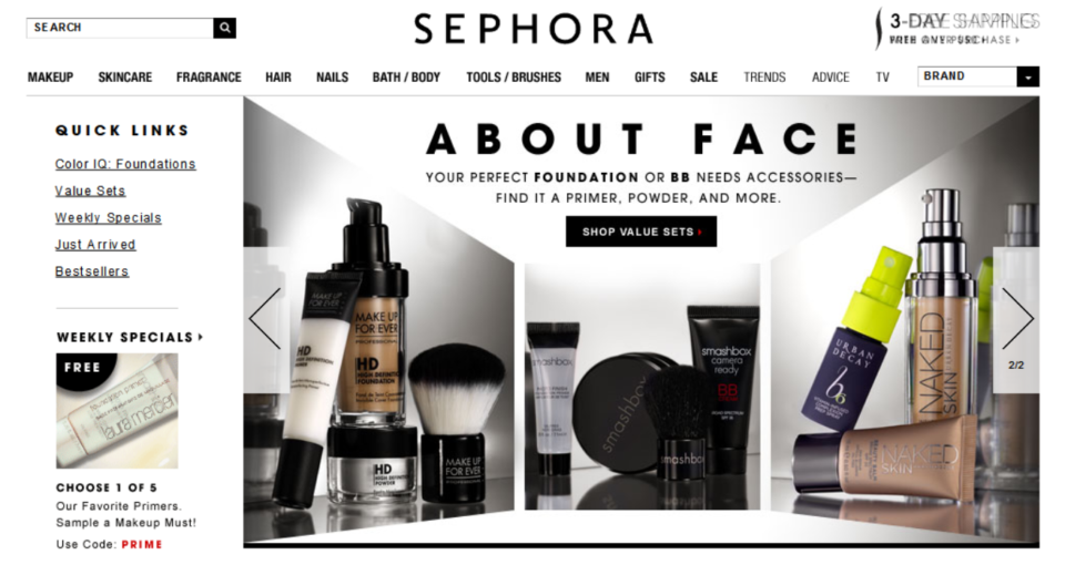
3. Give Your About Page Some Love (52% of Your Visitors Will See It).
Your about us page is actually one of the most visited pages on your website.
In fact, people will often decide whether or not to buy from you based on what you say on this page. So it’s important!
In fact, the Wordstream Blog changed up their “About Us” page and raised their conversion rates by 13%. Just by tweaking their website’s about page!
To help you spruce up your about page (or create one if you don’t have one), here are a few tips and trick:
- Understand your customer’s problem. Your sole purpose should be to solve your customer’s problem, so spend some time talking about how you help your customer instead of yourself.
- Be personal! You’ll want to be personal, but not too personal. In other words, give them the rundown of what your company is about, but don’t give them details about what you’re doing in your free time.
- Insert a picture/video of your company. If you have an office, take a picture of everyone SMILING as they’re hard at work. If not, ask your employees to send you a picture (or two) of them, along with a short bio.
- Give a quick paragraph about your business as a whole. Talk about how (and why) you decided to get into the business you’re in. Why did you create an eCommerce store from scratch? What made you realize there’s more to life than the 9-5 shift? And why do you care about the work you’re doing?
- Talk about what makes you different. Do you offer free consultant calls? Do you drop free PDFs in your reader’s email bi-weekly? Figure out your companies strengths and harness them.
- Provide testimonials and reviews. Testimonials and reviews help to establish credibility. You’re getting real people to show success in your products and services (without having to deliver a sales pitch).
- Conclude with a CTA. If you sell them on why you’re doing what you’re doing, what makes you different, and how your product solves their problem, and they’re almost certain to buy. Sales machine, check!
The next e-commerce website best practice, like the last two, also revolves around building trust.
4. Bake Customer Reviews Into Your Process (They Increase Sales 88%).
Customer reviews and testimonials are one of the BEST ways to increase sales to your store.
In fact, Bright Local found that product reviews increases conversions by 88%!
As it turns out, consumers trust online reviews just as much as personal recommendations.
So how do you get more customer reviews?
- Automate the process. Any time you make a sell, send an automated email that goes out one week after their purchase (to give them enough time for shipping and to use it) that asks them to leave a review.
- Reach out to past customers. If you didn’t have these automated emails set up already, reach out to past customers asking for a review. Bonus points if you actually pick up the phone and call them to see what they thought (this is another e-commerce best practice that most people don’t do).
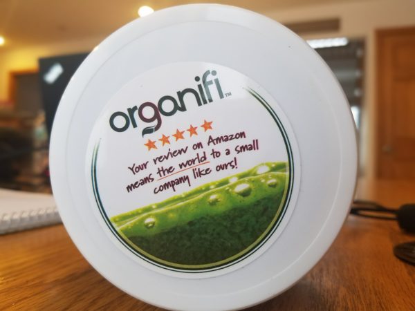
- Bake it into your product packaging. For example, Organifi loves connecting with their audience. They’re not afraid to ask for a quick review on the bottle:
While you’re at it, make sure you also take the time to respond to and amend any negative reviews. Not only do negative reviews make you feel like crap, they’ve also been shown to reduce conversions by 39%.
5. Make Sure Your Site Loads in Less Than 3 Seconds (Or You’ll Lose 7% Conversions).
The last general e-commerce website best practice I have for you is this…
You need a fast website. The benefits of a fast store are amazing – but the drawbacks are killing your sales:
Let’s say your e-commerce website is making you $1,000 per day. Even just a 1 second page delay could cost you $25,000 yearly. Yikes!
So how do you find out how long your site takes to load?
Easy – just plug it into the Ping Website Speed Test Tool.
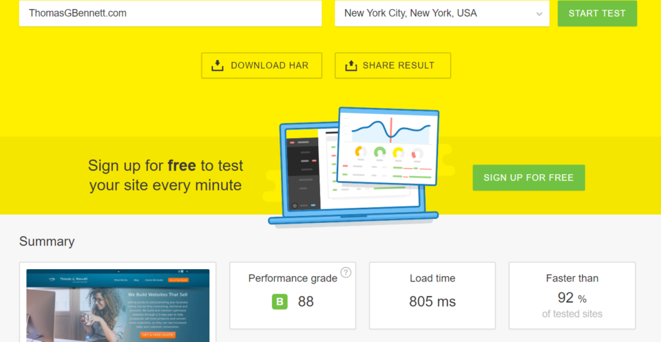
This tool will tell you how long it takes your site to load, as well as any errors you may have and how to fix them.
Luckily, site speed is (usually) easy to amend.
While your site may have some serious internal coding errors that need a web developer to fix, the majority of speed issues can be improved by…
- Optimizing all your images. As a rule of thumb, your images should be no larger than X Kilobytes (KB). While this isn’t always possible, it’s a good number to aim for. Follow this guide to image optimization and compression for help.
- Changing your hosting provider. The company that hosts your website could be the culprit for a slow loading speed. In fact, this should be the first thing you check after you’ve compressed your images. We recommend Red Wagon Hosting.
- Utilizing browser caching. Browser caching essentially “stores” your website on past visitors computers, so it loads faster the next time they visit your site. Research shows that enabling a full cache for a website can reduce the website loading time from 2.4 seconds to 0.9 seconds! That’s huge.
If you are using WordPress, here is a thorough guide to help you to speed up WordPress. But if you’ve implemented these changes and your website is still loading slowly, feel free to reach out to me. I’d be happy to take a look and see what might need to be done to fix it!
Mobile E-commerce Best Practices
You can’t talk about e-commerce trends without covering mobile.
Just look at the stats:
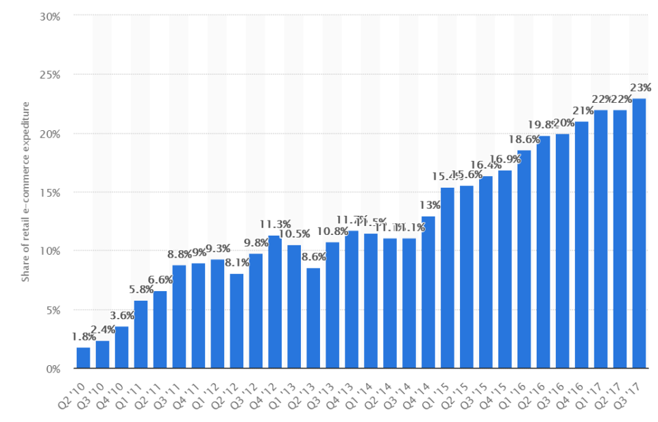
A whopping 62% of e-commerce website traffic comes from mobile devices. And that’s not all…
Of the $78.6 billion spent on online retail in 2017, $18 billion of it was purchases made on mobile. That’s huge!
Not to mention that 57% of users have said they don’t bother recommending a business with a poorly designed mobile site.
So how do you capitalize on this trend and make sure your online store is mobile-friendly?
Keep reading to find out.
6. Allow Image Zoom (You Know – That Pinch Open Thing).
Not being able to zoom in on a product photo while shopping online is one of the most annoying things I’ve ever experienced.
Here’s what I mean:
Image Via: thenextweb.com
Basically, the easier you make it for your customers to image owning your product, the higher the chance you’ll close the sale. When people zoom in, they’re virtually interacting with you product to help them make a buying decision.
7. Use Touch-Optimized Keyboards for Each Form Field.
Have you ever seen the keyboard on your phone change when you clicked on a different form field? Like this:

Source: Grainger Industrial Supply and Baymard Institute
During usability testing, typos were much more common on sites that relied on the standard keyboard for numeric inputs, as seen on Grainger (left). Compare this to the 521% large keys when using an optimized keyboard (right).
For a number-only form, you show numbers. For a text form, you show text.
Simple, right?
And yet, Baymard’s benchmarking of mobile sites found that 54% fail to invoke optimized touch keyboards for either phone, ZIP code, or credit card form fields.
Be part of the 46% of smart mobile sites. Trim down the number of typos (and lost packages) with this simple change.
8. Don’t Use Auto-Rotating Image Carousels (They May Look Cool, But People Hate Them. And They Suck).
Some e-commerce trends popped up and took the world by storm. And they need to die.
Carousels are fine, but auto-rotating carousels cause major issues on mobile. (And, honestly, on desktop too.)
People report clicking on the wrong slide or being disrupted while trying to read one slide and then it shifted, causing them to have to wait for it to come back or to try and click back to it manually. Not a fun time.
ConversionXL even ran multiple tests, and found that image carousels get less than 1% of clicks, despite taking up more than half the home page. So just skip this trend.
What can you do instead?
Use static image content on the home page.

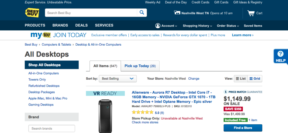
9. Make Guest Checkout Obvious (Frictionless Checkout Should Be Your #1 Priority!).
Making it stupidly easy to checkout should be your #1 priority. The more steps your visitors have to go through, the fewer will end up converting.
Just look at Amazon – they have you click one button to buy almost anything. It’s too easy to buy from them. (I couldn’t tell you how much I’ve spent on Amazon…)
But it’s not enough to just offer guest checkout. You also need to make it an obvious option, so people can actually utilize it. Like this:
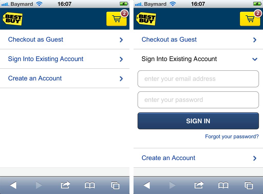
See how BestBuy lets you click a simple drop down? It doesn’t get much easier than that.
Pro Tip: Just because a user checks out as a guest, doesn’t mean you can’t get them to sign up for an account after they buy. In the post-purchase email, let them know that creating an account will make checkout easier next time. Better yet, offer an incentive like 10% off their next order or free shipping (if you’re not utilizing tip #1).
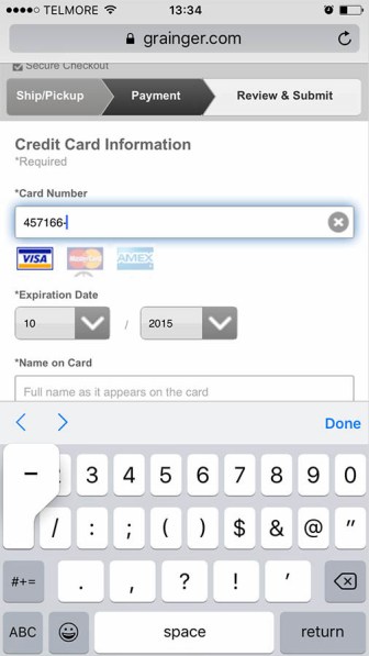
10. Disable Auto-Correct at Checkout (No, I Don’t Live On “Milligram Drive”).
Remember how we talked about typos leading to lost packages in point #7?
Well, auto-correct is the source of more lost packages than human error and accidents combined. (OK I made that up, but it still causes lost packages. You don’t want that, do you?)
Just take a look:
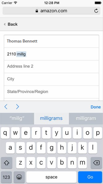
If I didn’t catch that auto-correct, my package would be going to “2110 Milligrams Drive”. Whomp-whomp.
It’s a simple fix. To disable auto-correct for a form-field just set: autocorrect=”off”.
E-commerce Product Page Best Practices
Your product page is the second most important page on your site. (The most important being your checkout page.)
So if your product page sucks, you’ll lose loads of customers.
But if it rocks?
Then you’ll be rolling in the dough!
Quick Note: We’ve already written the ultimate guide to product page design, so head over there when you’re ready to give your product pages an overhaul.
For now, here are some quick product page best practices from that post:
11. Use Big, Sexy Product Images to Mesmerize Visitors Into Customers.
Your photos are EVERYTHING!
Great product descriptions are important. Reviews are really important. A strong call to action button that’s above the fold is important.
But pull away the photos and none of that matters.
If you’re using amateur photos that are “good enough”, but still look kind of unprofessional, that’s hurting your conversions.
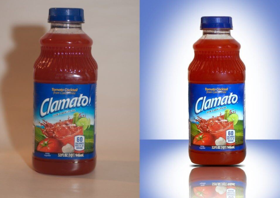
So follow this guide to product photography OR ask your supplier for some top-notch photos. Just make sure you optimize and compress them so they don’t slow down your loading speeds!
12. Create a Product Video (Or 360-Degree View) to Give Visitors A Better Mental Picture.
Remember how I said your customer needs to be able to imagine themselves owning a product when we discussed image zoom?
Well a surefire way to help them do that is with product videos to accompany your photos, like this awesome example from Solo Stove:
In fact, videos have been shown to increase conversions by 71%.
Ready to get started? Check out this guide to creating amazing product videos. Alternatively, you can follow this guide to making 360-degree view images, which work in much the same way.
13. Use Price Anchoring and Scarcity to Hack Visitors Psychology.
Price anchoring is the practice of establishing a more expensive item to make the less expensive option seem more enticing.
This enables you to guide your customer to purchasing the exact option that you want them to.
The benefits of price anchoring go both ways.
A study by Conversion XL shows how anchoring prices actually helps the customer differentiate one item from another. They go on to say that “when similar items have the same price, consumers are inclined to defer their decision instead of taking action.”
Would you rather have a customer motivated to make a decision or paralyzed by too many similar items? We thought so.
Which brings us to scarcity.
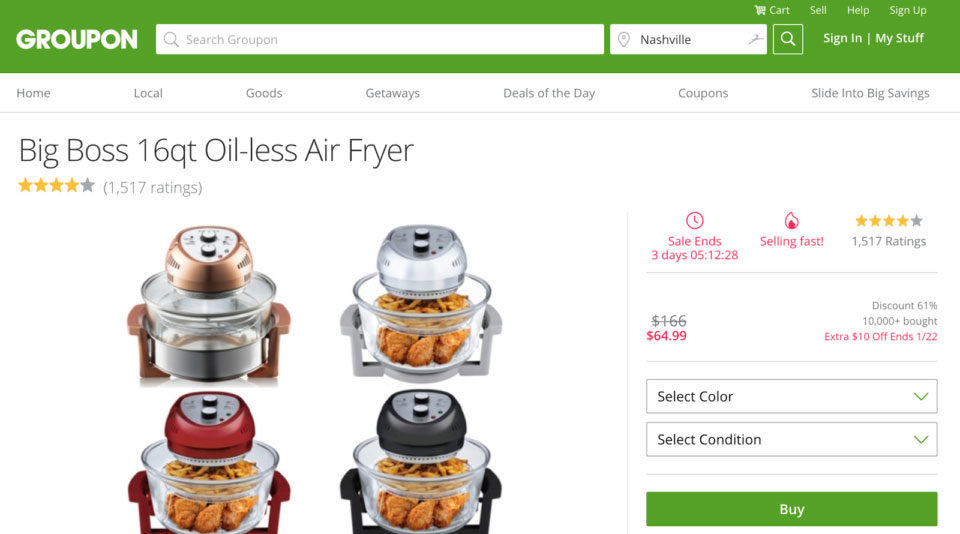
According to Conversion XL, scarcity is “the phenomenon where, when a product or service is limited in availability (or perceived as being limited), it becomes more attractive.
This can be anything from a three-day sale to alerting your customer of the limited stock for a particular product.
Here are some great examples of scarcity:
Notice how the example below uses a timer and “Selling Fast!” to make the customer to feel a sense of urgency.
14. Have a Prominent Call to Action and Rake In the Sales.
You could have a beautiful website, but if there’s no call to action you’re wasting your customers’ time.
People don’t come to your website to simply look. They come to buy, subscribe, download, etc. The quicker you can help your customers achieve this, the happier they’ll be.
Notice how the Beauty Pitch website not only has compelling pictures and videos, but it also has a clear call to action (Purchase Tickets Here).
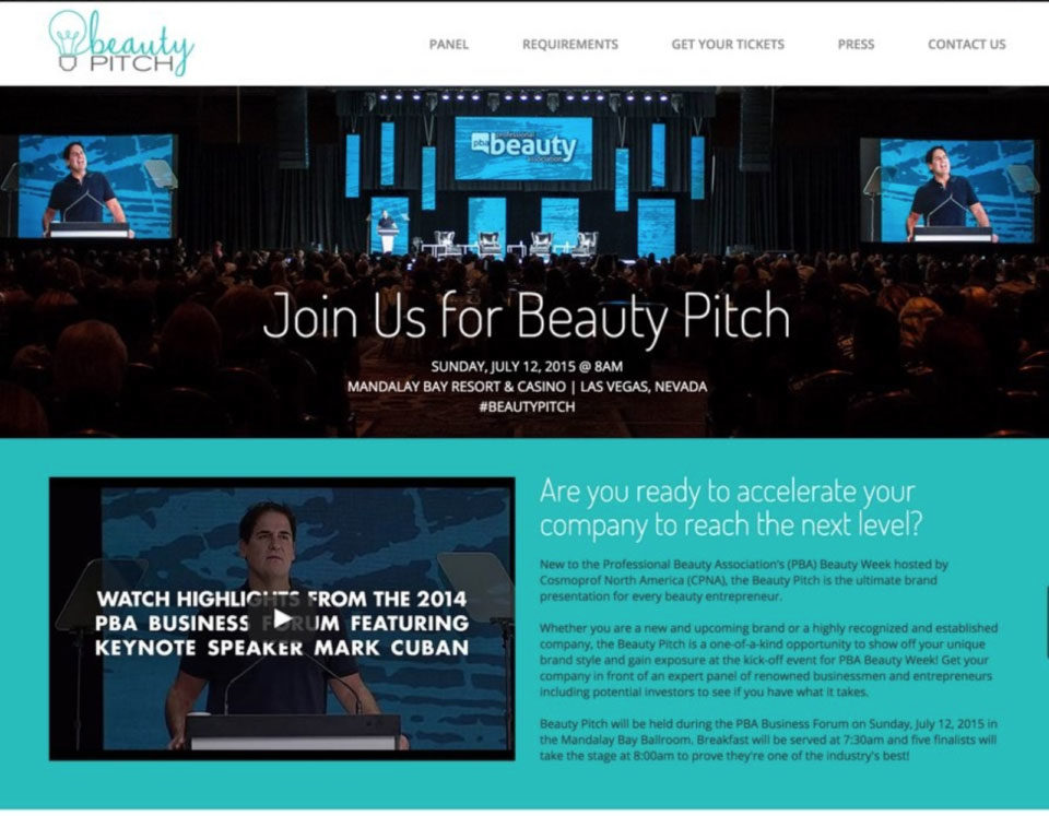
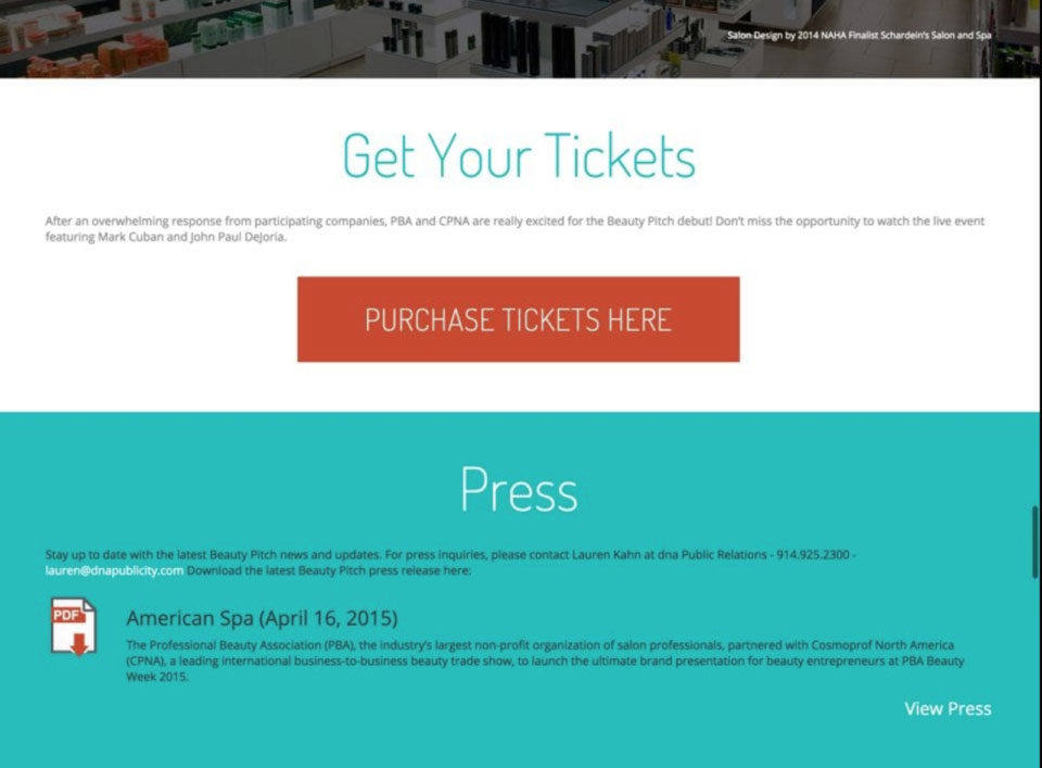
There are no other buttons to click once you get to the CTA button. In addition, the color stands out against the white backdrop and blue accent colors.
Make your CTA so prominent that customers can’t wait to click on it!
Also, don’t be afraid to A/B test CTA button colors and text until you find what resonates with your site users. While you’re at it, here are some other A/B testing ideas for conversion optimization:
- Try different value propositions, such as pricing or free add-ons
- Test product copy and different quality images
- Add different types of security seals/trust badges
Just remember to only test one element at a time!
If you’re looking for some extra tips for CTA optimization, we especially like this article from Classy.org.
E-commerce UX Best Practices
User experience is MASSIVELY important to e-commerce website design. The easier and more intuitive your store is, the more sales you will make and the happier your customers will be.
Just look at Amazon – they’ve spent millions of dollars mastering their UX design. And it’s done well for them.
Let’s dive into some e-commerce UX best practices.
15. Adhere to The “F” Pattern.
Studies by the Nielsen Norman group found that users spend as much as 80% of their time viewing the left side of the page compared to the right.
This eye-tracking research is what leads experts to the “F” pattern. This layout allows your site visitors to naturally take in the most important elements of your page and mentally create a hierarchy of the information.
Image via: UX Planet
Here’s an example of the F pattern in action:
When using the F pattern we suggest that you:
- Put the most important information on the top of your page
- Expect that your site viewers will scan and not read (format your text accordingly)
- Position your CTAs on the left and right sides (this is where the site user will start and finish their scanning)
- Use sidebars to encourage your customers to stay engaged with your site
16. Use No More Than 2-3 Colors Sitewide, You Crazy Artist!
You may be tempted to use all of the colors for your website. But for the love of your conversion rate, please don’t.
The best way that you can get a potential customers’ attention is by communicating a clear and concise message.
How?
Make your site copy succinct and use a limited color pallet (no more than three colors).
Once you’ve chosen your three colors, follow the 60-30-10 rule. According to Crazy Egg:
- The primary color should cover about 60% of the space and create the overall unifying theme of the design.
- The 30% should contrast with the 60% to create a visually striking effect.
- The 10% is an ‘accent color’, which should complement either your primary or secondary color.
See how these sites below follow this rule?
If you’re still stumped on which colors you should use for your website, here’s a great place to get started.
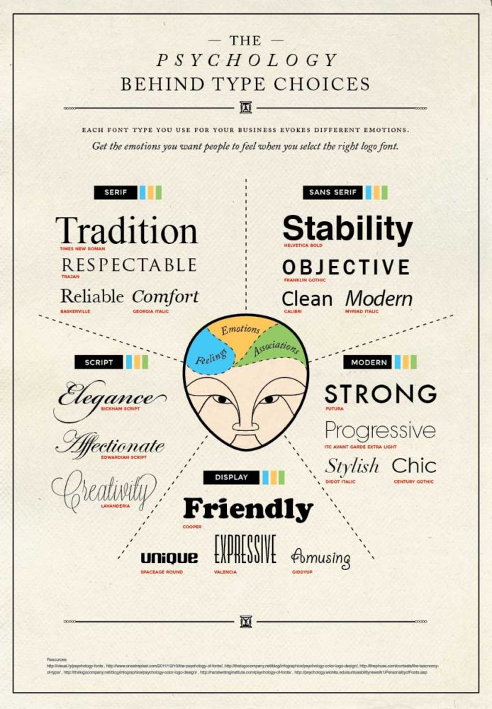
17. Use Large, Readable Font (16px Is Ideal)
Like color pallet, font plays a huge role in conversions.
Have you ever been to a website with font so small you could barely read it? How long did you stay on the site? We’re guessing not very long!
Experts say that 16 pixels is an ideal font size. It’s readable without being too obnoxious.
Make sure that the font you chose displays your messaging clearly. A script-like font may look nice, but can your customers actually read how your products can benefit them?
This helpful infographic from websitebuilderexpert.com showcases what emotions the different typography evoke.
18. Add Breadcrumbs (Not the Kind You Eat)
Remember that old Hansel and Gretel fairytale? This web design practice is a nod to Hansel and Gretel leaving a trail of breadcrumbs behind them so they wouldn’t get lost in the woods.
Did birds end up eating those breadcrumbs? Well, yes.
However, there is an important lesson we can learn for web design: always leave a trail behind you.
And for good reason — most e-commerce sites have a lot of products to sift through.
On your site, these breadcrumbs are text links separated by the (>) sign. The string of text links and arrows clearly defines where you are and how you got there. Like this example from Best Buy:
Top three reasons we love breadcrumbs:
1. They clearly define where your customers are on your site
2. Google uses them in search results
3. They save your customers’ time (no more endless clicking to find a product)
Location, location, location
According to Medium, “breadcrumbs placed directly near the page title received a whopping 82% of all breadcrumb clicks.”
Simply having breadcrumbs on your site is good. Placing these breadcrumbs in a highly visible location is even better.
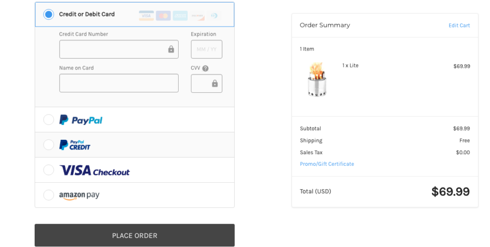
19. Offer Multiple Payment Options
Once your customer finally reaches the checkout window, the last thing you want is for them to abandon their cart because of insufficient payment options.
This study found that 50% of customers jumped ship because their preferred payment option was not available.
Be sure to offer plenty of options for your customers. Thankfully, these days there are no shortage of payment methods to add to your site.
We suggest that you take a good look at your target audience and the ways that prefer to pay online.
And always display trust signs on your site (remember point #2?).
The example below from Solo Stove does a great job of offering many viable payment options (no customers lost there!).
E-commerce Homepage Best Practices
We’ve talked about general site best practices, product page best practices, mobile design and UX. Now let’s chat about your homepage.
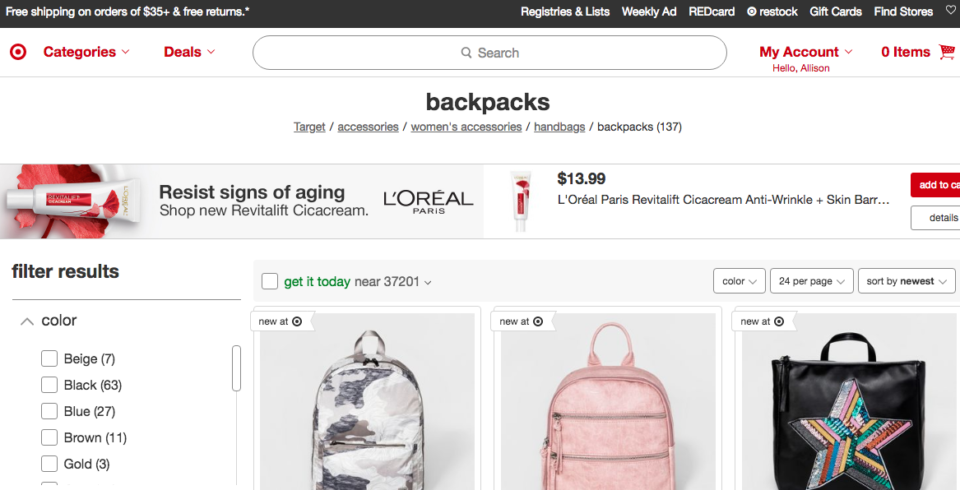
20. Always Show The Search Bar So Visitors Never Get Lost.
According to a study by Hubspot, 76% of users want to be able to easily find what they need. (Really, who doesn’t?) This comes before aspects like website design and a “cutting edge interactive experience.”
In other words, your search bar is a huge priority. Don’t neglect it!
If you want high conversion, make that search bar prominent on both your mobile and desktop sites. Also, be sure that the search bar is static so customers can use it no matter where they are in your online store.
No matter where you are on the website, Target’s search bar is static (and highly visible) on the top of the page:
21. Show Browsing History for Personalized Suggestions.
The online shopping experience is much more personalized than it used to be. These days, more access to data allows e-commerce companies to tap into what their customers truly want.
This study even shows that 56% of online shoppers are more likely to return to a site that recommends products.
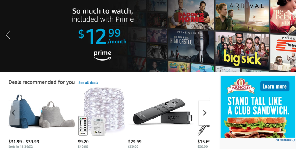
We suggest posting product recommendations based on customers’ individual searches directly on your home page — just like Amazon does below.
How’s this done? More than likely, you’ll need custom code. Unless it’s built into your website’s theme or CMS. Click here to contact us and we’ll let you know what you need.
22. Display Your Business Address and Support Number.
Contact info on your homepage is a great way to build credibility with your customers. It gives your customers the comfort in knowing that you are available and happy to help with their needs.
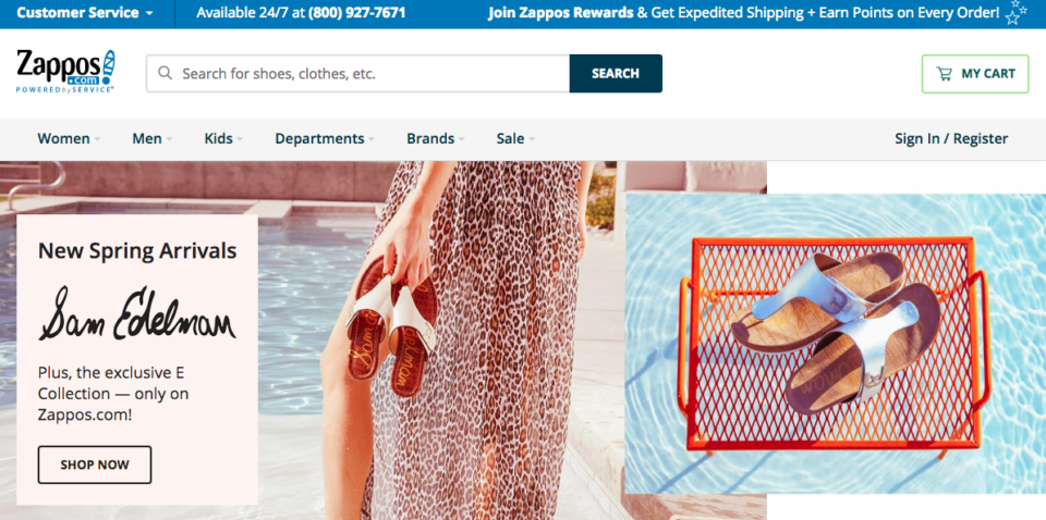
If you’re searching for the golden example for customer availability, look no further than Zappos. Notice how their customer service number is displayed prominently in the top left hand corner?
Zappos CEO, Tony Hsieh, states:
We’ve found that on average, our customers telephone us at least once at some point, and if we handle the call well, we have an opportunity to create an emotional impact and a lasting memory. We receive thousands of phone calls and e-mails every day, and we view each one as an opportunity to build the Zappos brand into being about the very best customer service.
Contact info on your homepage is an open door to long-lasting customers. Don’t waste this valuable opportunity!
23. Include Social Proof (Yes, We’re Talking About Reviews Again).
According to HubSpot, social proof is the, “idea that consumers will adapt their behavior according to what other people are doing.”
In other words, it’s leveraging your customers into one of your greatest advertising tools.
And guess what? It actually works.
A study on Rent the Runway shows how visitors referred by bloggers and fashion influencers generated a 200% higher conversion rate than people who were referred to the site by a paid ad.
Another study by Search Engine Land, showed that 88% of online shopper trust online review as much as recommendations from somebody in their circle.
When you place social proof directly on your homepage, you’re establishing that credibility right from the start.
Here are some companies that do a great job of displaying social proof directly on their homepage:
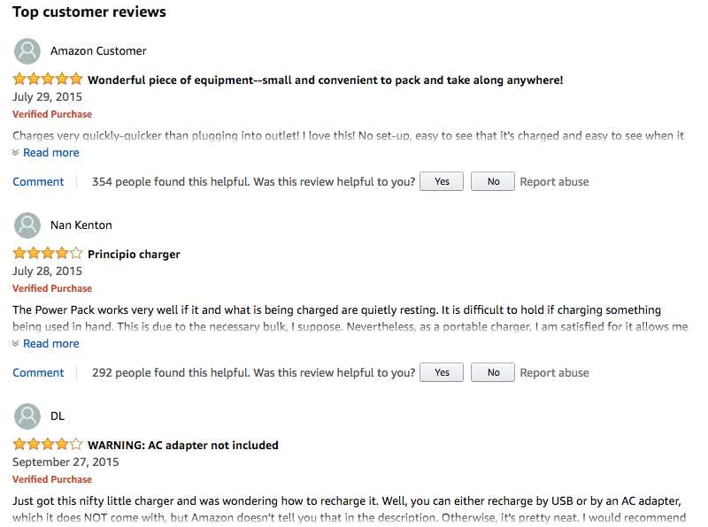
Amazon places product reviews directly on the product page to help customers make a purchase decision.
InVision (a digital product design platform) shows social proof through the strength in numbers approach. If 3 million people have already signed up, it must be good.

24. Make a Sales and Best-Sellers Section
Studies show that when you clearly display a best-sellers link and use a specific color to make it stand out, conversions increase by 30%.
Just as a server at a a restaurant tells you about the most popular dishes, a best-seller section guides customers to the products they are most likely to benefit from.
Similarly, a sales section give customers a direct path to what is most enticing — your products at a discounted price.
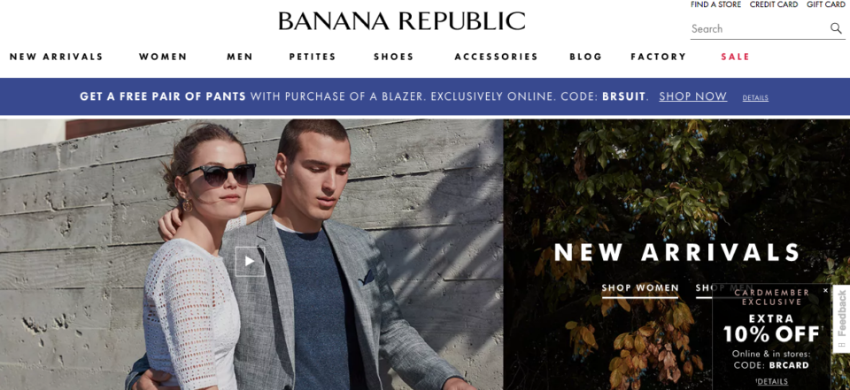
Take a look at how Banana Republic includes their sale section at the top menu and highlights the text in red.
Best E-commerce Websites of 2018 (So Far)
Last but not least, we’ll leave you with three of our favorite e-commerce sites that look great AND convert like a beast.
1. Solo Stove
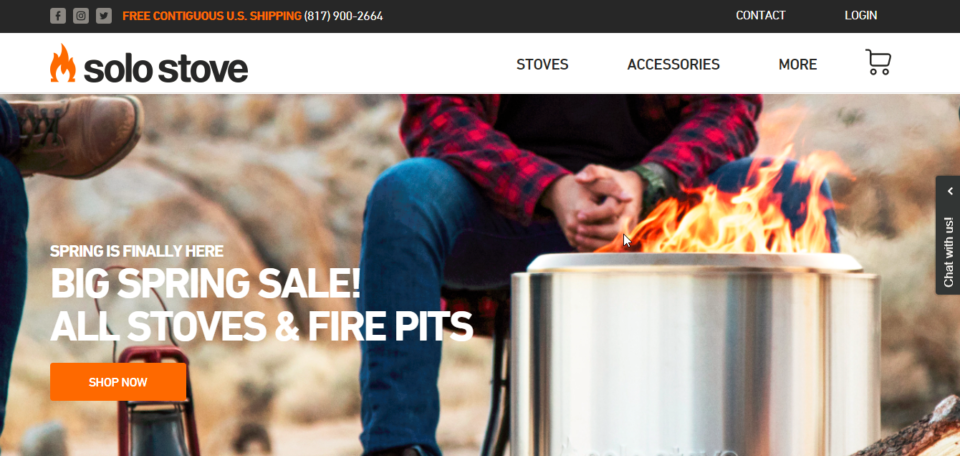
We talk about Solo Stove a lot – that’s because it’s one of the best e-commerce websites we’ve ever seen. Let me explain…
What We Love About It:
- Clean, simple, modern design
- Prominent call-to-action buttons
- Excellent inclusion of product reviews
- Very high-quality product photos
- Intuitive user experience
- Strong use of multi-media, like videos and interactive content
2. Death Wish Coffee
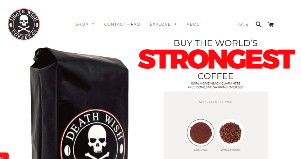
Death Wish Coffee combines a great shopping experience with a fanatic niche – people who are obsessed with the absolute strongest coffee in the world.
What We Love About It:
- They’re not afraid of white space
- Prominent call to action on the homepage
- Subscriptions make for monthly recurring revenue
- They have a podcast!
- Their about page is personal and tells their story
- An awesome product description
3. Amazon
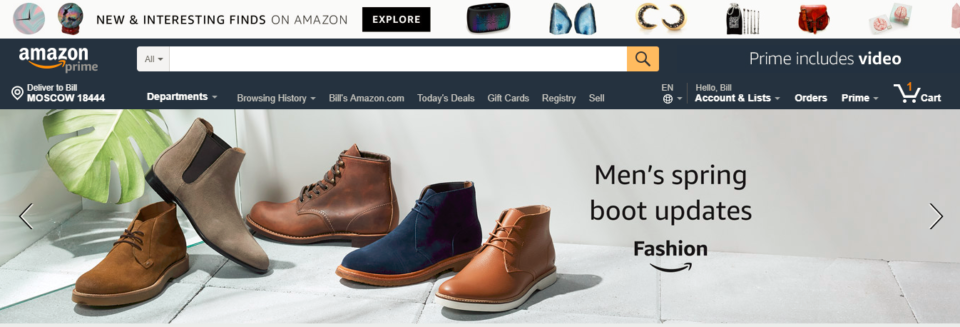
We can’t talk about the best e-commerce websites without talking about Amazon. They’re the kings of conversion rate optimization.
What We Love About It:
- Extremely fast loading time
- Huge product selection at low prices
- Free two-day shipping
- World-class customer service
- Excellent use of scarcity
- Personalized shopping recommendations
What did we learn?
When it comes to e-commerce best practices, there’s a lot to take in.
Between optimizing your homepage to improve your sales, ensuring proper SEO, shooting product photos and digital marketing, e-commerce entrepreneurs like you and me wear a lot of hats.
Our advice?
Pick ONE thing from this list. Implement it and see how it goes. Once that’s done, come back and do one more. You’ll have a fully optimized store before you know it!
(Pro Tip: We recommend starting with your checkout page, then reverse engineering from there to your product page, then home page.)
If this all feels overwhelming or you just don’t have the time to do it, get in touch with us. We can help you design the ultimate shopping experience and increase your sales, just like we have for dozens of other store owners. The initial call doesn’t cost a dime, and we’re very low-pressure!