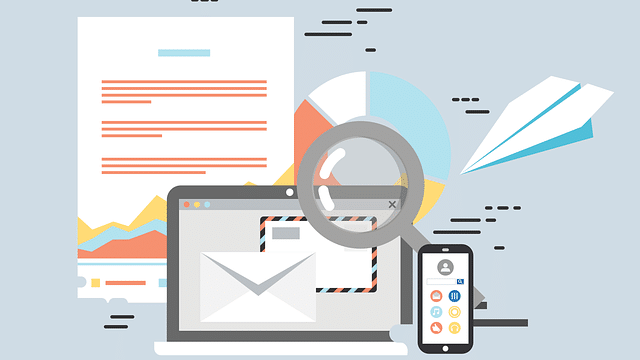
Five Questions to Make Your Website More Effective [+] FREE Checklist
Making changes to your website can seem like an overwhelming task, even for the most experienced marketers. When it comes to your website, it can be hard to decipher what is working and what you should improve. We often hear, “I need a new website but have no idea where to start.”
Trust us — we get it.
That’s why we’ve compiled a list of five areas every marketer should ask about their website.
Want to learn more about how to improve your website? Click here to download our free Website Assessment Checklist.
1. Does it pass the Grunt Test?
In Donald Miller of StoryBrand’s words, if a caveman landed on your homepage would he understand what you do? Your site’s purpose should be crystal clear. Your visitor should be able to answer three questions in about five seconds.
- What do you do? If it’s not obvious, your customer won’t stay on your site for long. We suggest writing a short one-liner about what you offer and placing it in the header.
- How do you make my life better? You need to speak directly to your customer’s pain point. People buy products that speak to emotion.
- How can I buy it? Don’t tiptoe around selling your product. A clear, direct call to action needs to be in the top right corner and very obvious.
Another tip for passing the Grunt Test? Follow the F-pattern
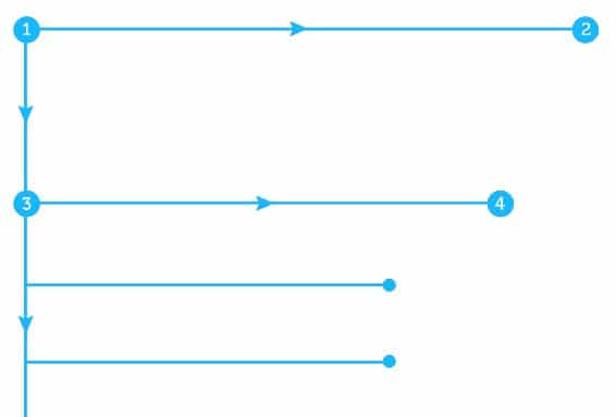
Image via: UX Planet
The F-pattern is when somebody views your website starting at the top left-hand corner and scrolls with their eyes to the right.
When you follow this, your site visitors are able to naturally take in the most important elements of your page and create a mental hierarchy of the information.
In fact, research by the Nielsen Norman Group found that users spend as much as 80% of their time viewing the left side of the page compared to the right.
As you make any changes to your website, consider the overall layout. Are you using the F-pattern to help customers take in the most important information?
2. Does your homepage convert?
Your homepage is the most viewed page on your website. But is it really setting your business up for success (a.k.a. more conversions)? Here are our top suggestions for a homepage that guides your customer towards a purchase:
Optimize your logo
- Place this in the top-left hand corner of your site.
- Make it clickable.
- Don’t make it too big (You want people to know who you are but don’t want the logo to overpower your whole website).
- Make sure your logo or tagline tells what you do or offer.
Limit the number of links
- We suggest no more than 3-4 links.
- Use analytics to determine what your most clicked links are and plan your customer’s path with this insight.
- Don’t be afraid to get strategic with a “Best Sellers” or “Our Favorites” tab.
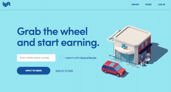
Lyft takes a simple approach by only including three choices in the header. The CTA button makes the intent of the homepage clear: they want site visitors to sign-up to be a driver.
Move less important information to the footer
- Consider moving links like your blog to the footer. It’s already serving its SEO purpose without being front and center.
- Unless necessary, place your address in the footer. However, make your phone number visible so customers can easily reach you.
Add a search icon in the top right-hand corner
- According to Hubspot, 76% of users want to be able to easily find what they need.
- Make the search bar static so customers can use it no matter where they are in your online store.
Make your Call to Action stand out
- Place your primary CTA in the top right-hand corner and make it stand out with a different color.
- A/B test your CTA to know what your customers are most likely to click.
- Use strong, action-oriented language to drive your customers to make a purchase.
3. Do you establish authority?
Your customers want to know that you are a leader in your field. In order to communicate this, there are specific signals you should place throughout your website.
Here are a few ways you can establish brand authority:
- Give social proof. Share customer testimonials or reviews directly on your homepage. These will showcase the value of what you offer and build credibility.
- Display certifications. Internet shoppers can be wary of giving away their credit card information away—and for good reason! Showcase any certifications or achievements directly on your homepage to increase trust with your customers.
- Tout customer statistics. How many customers have you helped achieve success? Share statistics like this as another way to build credibility with your potential customers.
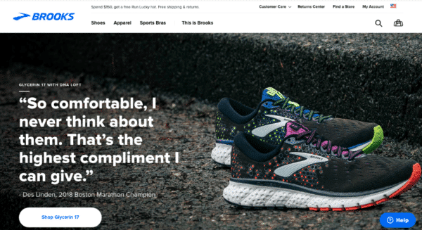
Take a look at how Brooks uses their homepage to build brand authority with a quote from a marathon champion:
4. Is your Call To Action clear?
If you want your customers to take action, you need to clearly define what you want them to do. It’s important to clarify your CTA and remove any distractions or hesitations that keep your customers from buying.
Always use words that drive your customers to action
Since your customer is likely scanning down your page, it’s important to place multiple CTAs on your website. We also recommend using language that drives your customers to action.
Remember, people don’t come to your website to simply look. They come to buy, subscribe, download, etc. The quicker you can help your customers achieve this, the happier they’ll be.
| Passive Language Browse our shirts Take a look Learn more View services |
Active Language Buy Now Download Your Free Guide Register Today Book Your Room |
What are your customers most likely to click on?
Don’t be afraid to A/B test CTA button colors and text until you find what resonates with your site users. There are a lot of tools out there that make A/B testing easy. Just remember to only test one element at a time. Below are the CTA button elements we suggest testing:
- Color
- Copy
- Font
- Position
- Design
- Size
5. Do you have a lead generator?
When your customers simply aren’t ready to buy, a lead generator is an excellent way to keep them engaged in your brand. As a result, they’re more inclined to make a purchase down the road.
Most lead generators offer a free service or resource in exchange for their contact information.
Here are a few examples of lead generators:
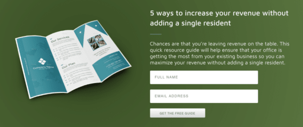
Downloadable PDF – We suggest offering a free checklist or guide in exchange for basic information like your customer’s name and email address. Make sure that the content is about a topic that captures your audience’s attention and solves a problem they have (just like the example below).
Interactive Quizzes – This is a fun way to get your customers involved in your brand and what you can offer them. Once the potential customer completes the quiz, they can sign-up to receive the results in their inbox.
Video Content – If you want to take your lead generator to the next level, we suggest creating a single video or video series offering advice in your particular area of expertise. Once they include their contact information, offer a link to download or watch the video.
More lead generator ideas:
- Free trial
- Downloadable worksheet
- Product sample
- Free course
Your next steps towards a better website
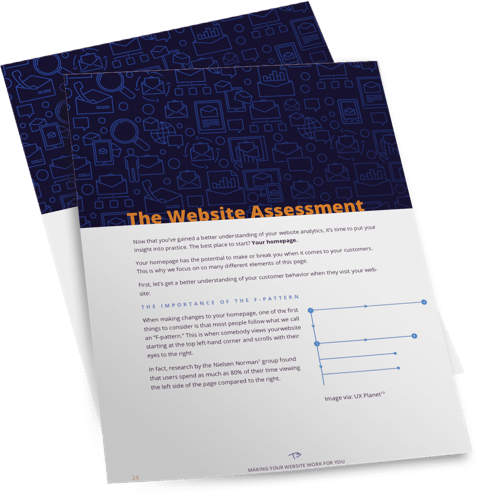
These five questions are an excellent place to start improving your website. However, if you want to take it a step further, we now offer a free Website Assessment Checklist.
Our Website Assessment Checklist allows you to identify what’s working on your site and what isn’t. It includes questions to help you dig into your website and create changes to increase sales.
Website Assessment Checklist
Most businesses are wasting thousands of dollars redesigning their website and on aimless marketing. This free checklist will guide you through quick and proven improvements you can make today that will make your website more effective.
*Your privacy is important to us. We’ll never share or sell your personal information.